I was quite struck some years ago, 2014 it must have been, by an analysis of the design of the original starship Enterprise that showed how it relied heavily on the “Golden Ratio,” the artistic proportion of 1.618. And how I realized that all the later iterations of the Enterprise betrayed that aesthetic.
The Golden Number, Gary Meisner, 2 May 2014: Phi in the 23rd Century – Design of Star Trek’s USS Enterprise.
There is some well-known backstory to the design of the Enterprise, as discussed briefly in the article linked here. Mind you, again — we’re talking about the original version of the Enterprise, in TOS [the original series] version of Trek that ran on TV from 1966 to 1969; all later versions, in all the movies and later TV series, it seems to me, compromised this design to one extent or another.
Gene Roddenberry, Trek’s creator, came to designer Matt Jeffries asking for a spaceship unlike any other, “with no fins, rocket exhaust trails, powerful and capable of exceeding the speed of light…”
The designs of spaceships in film and TV had, up to that point, been entirely based on two icons: rockets, and flying saucers. Mostly rockets, in early ’50s movies; increasingly flying saucers, in The Day the Earth Stood Still and many others, all the way up to the Jupiter II in the TV series Lost in Space (which debuted just a year before Trek.)
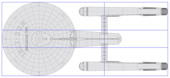
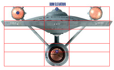
Jefferies started with a blank page and a marker, and with a very pragmatic design ethic. He reasoned that “a starship’s engines would be extremely powerful and potentially dangerous, and positioned them far away from the core of the ship, with the added benefit of modular design so that they could be ejected quickly in an emergency.” His design documents revealed that he was also a very exacting designer. He specified the dimensions on his designs to the 1/10000th of an inch. This was clearly beyond any practical level of accuracy in the construction of the small-scale models used on the Star Trek set and indicates that he was working with a mathematical precision based on geometric formulas and relationships.
Early sketches for the Enterprise involved spheres, rather than saucers, but all involved rocket-like tubes, a pair of them as propulsion. Here’s an image from the Trek site Memory Alpha:
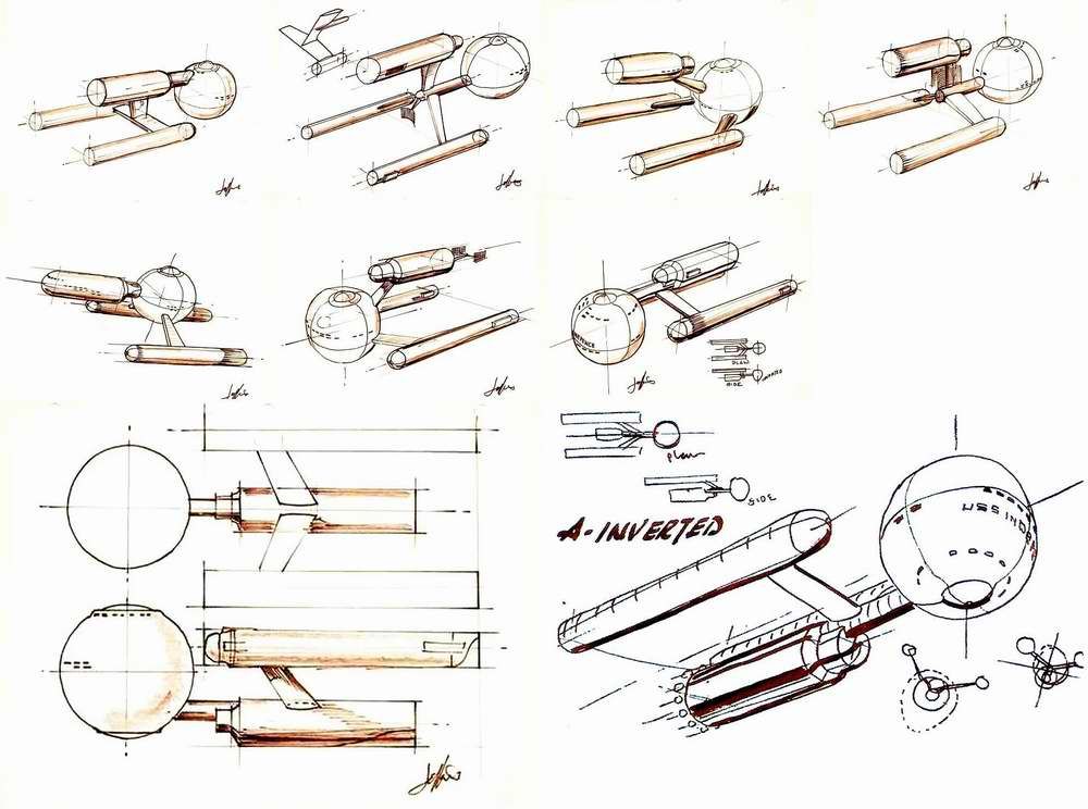
(And the article, which I’m not reading before writing this post. Though I see there was also a ring ship design, which would have been cool. Maybe better.)
Many have pointed out that the Enterprise design made no sense in a standard aeronautical, or aerospace, way. Those propulsion tubes, “nacelles,” couldn’t be rockets, else the moment they were ignited, they would simply snap off their pylons and leave the rest of the ship adrift. Also, *why* a saucer instead of a sphere? The saucer seems needlessly flat, as if imagination were constrained to planetary surface designs, whereas a sphere would surely be more efficient in terms of keeping atmosphere in and radiation out.
The rationale, presumably (though I’ve never seen this spelled out anywhere), is that the Enterprise had all sorts of force fields, like the one that mimics gravity inside the ship and the one (the “shields”) that provides defense from attacks. Presumably, when the ship went into “warp,” some field enclosed the entire ship to create a bubble that rode outside conventional space, in some way that the interior structure of the bubble didn’t matter. And that bubble was created by the powerful mumble-mumble engines inside those nacelles. It’s notable that the “impulse drive,” used when the ship moving at less than warp, was located at the rear end of the saucer, which, if you think about it, is almost perfectly placed for a center-of-gravity thrust for the entire ship.
And yet subsequent Trek movies and series kept altering the design. (Star Wars, to give the franchise credit, has always maintained a consistent aesthetic.)
The very first problem was in Star Trek: the Motion Picture, in which there’s a long, loving scene looking at the refitting Enterprise, in “dock” above Earth, and it looks like this:

What are these *swept-back* pylons?? To make the ship more aerodynamic? In space??
It just got worse. Every remodel of the Enterprise has betrayed the mathematical aesthetic criteria of the original.
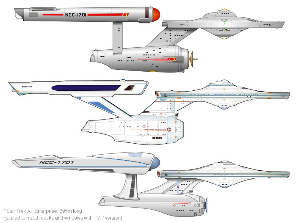
And for that matter, as the Trek universe explores its past, earlier starships are imagined as combinations of saucers, the occasional globe, and nacelles, sometimes even one, ungainly sticking out beneath the requisite saucer.
And yet, it’s legitimate to wonder, why? There must be some *other* aesthetic criteria coming into play. The general answer, I’d propose, is the kind of intuitive (wrong) physics that human almost always apply to unfamiliar environments. That spaceships must “bank” at an angle to make a turn, just like jet fighters do [Star Wars]. That spaceships all fly in a common plane, and meet each other same side up. And so on. I don’t have a final answer, but this is an issue I have thinking about for years.
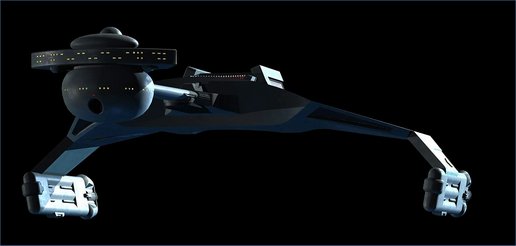
At the same time — to give Matt Jeffries full credit — the one original Trek spaceship that did not mimic all the later Enterprise designs, was the original Klingon starship.
\\
I was inspired by write this post, looking back at this 2014 article, by a couple other items recently that claim to identify certain aesthetic “truths.” One is about color palettes (60:30:10). How could these be “true” in any fundamental sense? Surely they simply reflect the biases of our human brains? Because of the species’ history in certain environments, where certain patterns in nature were safe, where certain combinations of colors recalled the ancestral environment? There’s probably more to it than that. I’ll be exploring.