Here’s one of my favorite counter-intuitive facts: how our impressions of the sizes of countries and continents that we get from (flat) maps are wildly inaccurate.
This isn’t news, of course; it’s a well known cartographic problem. Yet most people don’t realize, for example, just how enormous the continent of Africa is, compared to the rest of the world, because most of our wall maps distort and exaggerate the sizes of areas the farther away from the equator they are. (Whereas Africa straddles the equator.)
Memes about this go around on Facebook regularly, but recently a link came along that captures the entire issue on one page:
Visual Capitalist, 11 Nov 2021: The Problem With Our Maps
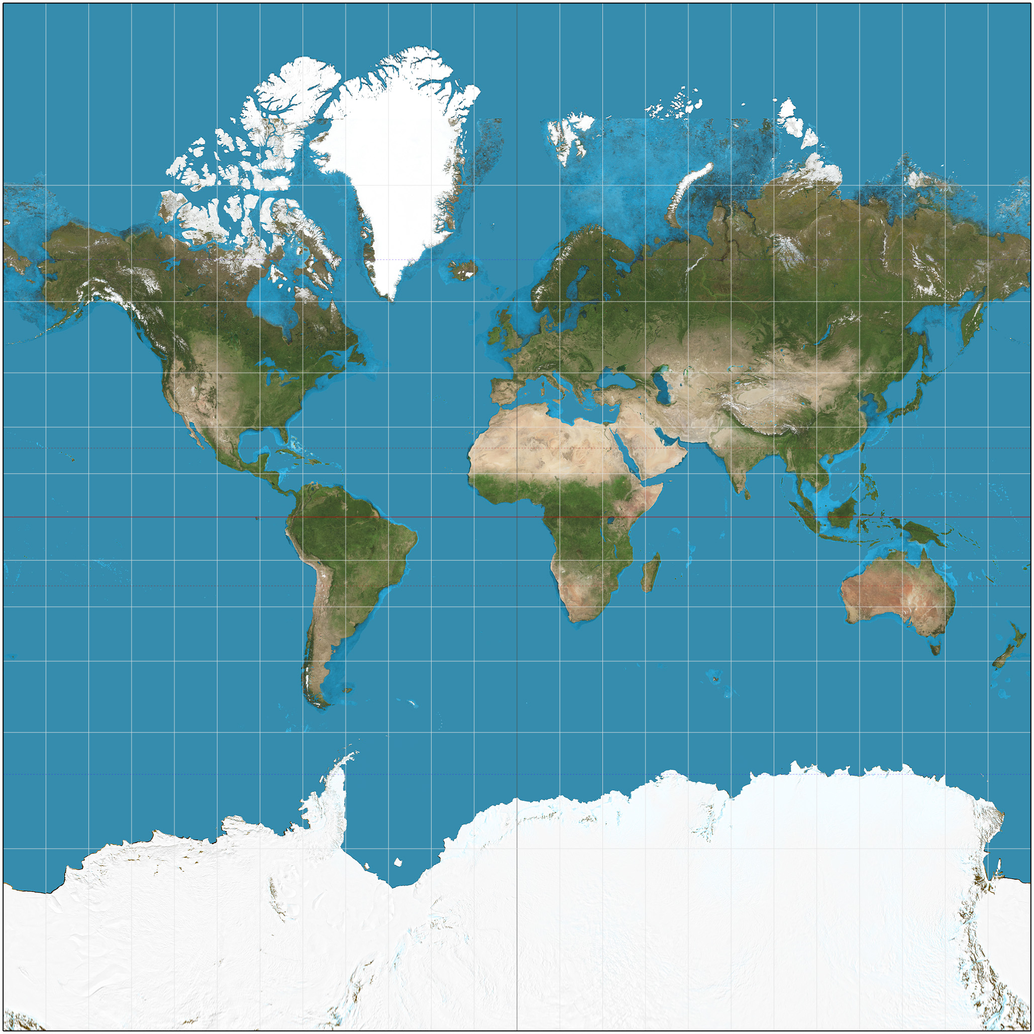
The standard map of the world on schoolroom walls is a version of the Mercator projection, above, typically cut off to show just the edge of Antarctica below, and most of Greenland at the top as well as the top of Asia.
The Visual Capitalist link shows another version of it, and then several alternate projections of the globe. The issue of course is that you can’t peel away the surface of a globe and spread it flat without distortions, or breaks. Thus Greenland on the Mercator projection looks as big as Africa, whereas in fact — as you can see by examining an ordinary globe — it’s nowhere near as large.
The most striking example of this problem is the graphic part-way down the Visual Capitalist page about “the true size of Africa,” in which the areas of the US, China, India, and several European countries are shown to fit entirely within the outline of Africa. Let me see if I can show that image:
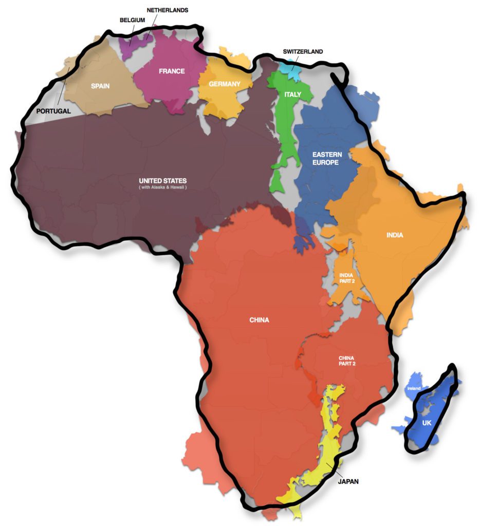
Again, it’s easy to confirm by just turning a globe back and forth and eyeballing the actual relative sizes of all the countries that fit within Africa.
There’s a whole page about this, from 2020: Mapped: Visualizing the True Size of Africa. I probably saw this circulated on Facebook when it was released.
My favorite projection is the Goode’s Homolosine project, despite it looking like an orange peel. But it’s less misleading than the other projections, and it constantly reminds you that a globe cannot be accurately spread flat.